Doroki
Logo
The Doroki logo has a vertical and horizontal lock up. Usage depends on available space.
The logo should have a clearspace the same distance as the height of the letter K in the logotype.
Main logo


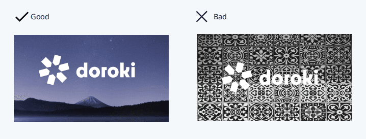
Do and Don'ts
We are conscious of our brand identity integrity as it is the brand integrity. It is important to note that no part of the brand identity should be reproduced for any reason.


Patterns
Abstract shapes can be used as decorative elements but should be done so sparingly.
The forms should always be abstract and never representative of real world objects.

Colours
The use of brighter colours should be limited with ‘charcoal’ and ‘pebble’ occupying the majority of the space inany given design.
Hex
#FF6A6A
RGB
255, 106, 106
CMYK
0, 73, 49, 0
PMS
1775C
Storm
Hex
#0F2531
RGB
15, 37, 49
CMYK
89, 71, 55, 63
PMS
5395C
Sky
Hex
#0091F0
RGB
0, 145, 240
CMYK
74, 37, 0, 0
PMS
2995C
Pebble
Hex
#F5F8FA
RGB
245, 248, 250
CMYK
3, 1, 1, 0
PMS
Cool Gray 1C
Blue Whale
Hex
#2B3C45
RGB
43, 60, 69
CMYK
81, 64, 54, 46
PMS
432C
Smoke
Hex
#907E99
RGB
144, 126, 153
CMYK
47, 51, 25, 1
PMS
7653C
Typography
Lowercase should be favoured. We are loud but not shouting.

Press release